スクロール連動アニメーションの実装例

広告
スクロールに連動して要素が画面内に入った際にアニメーションを行う実装のメモです。
スクロール連動アニメーションのコードと実装例
JavaScriptの実装はGitHub Gistに纏めています。コードにはTypeScriptを使用していますので、TypeScriptを利用していないWeb制作現場で使用する場合はChatGPTなどに依頼してJSファイルに変換してください。
initializeObserveAnimation. GitHub Gist: instantly share code, notes, and snippets.
gist.github.com
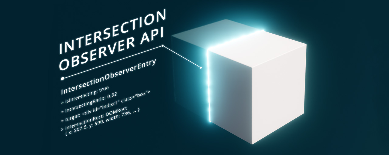
スクロール判定にはIntersectionObserverを使用する
要素が画面内に入ったタイミングを判定する手段として、scrollイベントを監視するのではなくIntersectionObserverを使用するようにします。
IntersectionObserver - Web API | MDN
IntersectionObserver は交差オブザーバー API のインターフェイスで、対象となる要素と祖先要素または文書の最上位のビューポートとがの交差状態(重なり合っている状態)の変化を非同期に監視する方法を提供します。その祖先要素またはビューポートはルートと呼ばれます。
developer.mozilla.org
IntersectionObserverはスクロールを直接判定するためのものではありませんが、スクロールによって要素が画面内に入ったかどうかを間接的に判断することができます。IntersectionObserverを用いることで、スクロールに応じて要素が表示領域に入ったタイミングを捉え、そのタイミングでアニメーションを開始するという処理を実現します。
export type ObserverOptions = {  root?: HTMLElement | null;  rootMargin?: string;  threshold?: number | number[];};
const defaultOptions: ObserverOptions = {  root: null,  rootMargin: "0px",  threshold: 0};
const initializeObserveAnimation = (  targets: NodeListOf<HTMLElement>,  options: ObserverOptions = {}): void => {  const targetsLength = targets.length;
  if (targetsLength === 0) {    console.error("initializeObserveAnimation: Target elements are not found.");    return;  }
  const mergedOptions = { ...defaultOptions, ...options };  const observer = createObserver(mergedOptions, targetsLength);  targets.forEach((target) => observer.observe(target));};
const createObserver = (  options: ObserverOptions,  targetsLength: number): IntersectionObserver => {  let observer: IntersectionObserver;  let activeCount = 0;
  const handleObserve = (entries: IntersectionObserverEntry[]): void => {    entries.forEach((entry) => {      if (entry.isIntersecting) {        // 要素が画面内に入ったら`data-animated`の値を`true`にする        entry.target.setAttribute("data-animated", "true");        // アニメーションした要素は監視をやめる        observer.unobserve(entry.target);        activeCount++;      }    });
    if (activeCount === targetsLength) {      observer.disconnect();    }  };
  observer = new IntersectionObserver(handleObserve, options);  return observer;};
export default initializeObserveAnimation
scrollイベントとの比較
かつて(IEが現役の頃)はscrollイベントを監視して要素の位置を計算するのが主流でしたが、この方法には次のような問題点があります。
scrollイベントは高頻度で発生する(1pxのスクロールでも動く)ため、パフォーマンスに影響を与えてしまう。- 要素の位置を計算するために
getBoundingClientRect()などのメソッドを使用して逐一アニメーションの対象となる要素を計算する必要性がある。 - レスポンシブで位置がズレる可能性がある。
一方、IntersectionObserverは、要素が画面内に入ったかどうかを非同期的に監視するためメインスレッドへの影響が最小限に抑えられ、要素の位置計算もブラウザ側で最適化されます。
また、scrollイベントを使用する場合はイベントリスナーの設定や要素の位置計算などの処理を自力で実装する必要がありますが、IntersectionObserverではそれらの処理をAPIが抽象化してくれるため、シンプルなコードを書くことに繋がります。
IntersectionObserverの使い方
IntersectionObserverを使用するには、まずnew IntersectionObserver(callback, options)を使ってオブザーバーを作成します。この時に、交差時に実行したいcallback関数(handleObserve関数)と後述するオブザーバーの動作を設定するoptionsオブジェクトを渡します。
const createObserver = (options: ObserverOptions, targetsLength: number): IntersectionObserver => {  let observer: IntersectionObserver  let activeCount = 0
  const handleObserve = (entries: IntersectionObserverEntry[]): void => {    entries.forEach((entry) => {      if (entry.isIntersecting) {        // 要素が画面内に入ったら`data-animated`の値を`true`にする        entry.target.setAttribute("data-animated", "true");        // アニメーションした要素は監視をやめる        observer.unobserve(entry.target);        activeCount++;      }    });
    if (activeCount === targetsLength) {      observer.disconnect()    }  }
observer = new IntersectionObserver(handleObserve, options) return observer}オブザーバーを作成したら、observe()メソッドを使って監視したい要素を指定します。これにより、指定した要素が画面内に入った時にcallback関数が呼び出されます。
const initializeObserveAnimation = (targets: NodeListOf<HTMLElement>, options: ObserverOptions = {}): void => {  // ...
const observer = createObserver(mergedOptions, targetLength) targets.forEach((target) => observer.observe(target))}optionsオブジェクトには次のようなプロパティを設定できます。
| オプション | 説明 | デフォルト値 |
|---|---|---|
| root | 監視の基準となる要素を指定します。 ブラウザのビューポート(表示領域)が基準になります。 スクロール連動アニメーションの実装ではこの値を変える必要はありません。 | null |
| rootMargin | rootで指定した要素からのオフセットを指定します。使用できる単位は pxと%です。CSSの marginと同様に'10px 20px 30px 40px'や'10% 0%'のように記述します。ただし、CSSとは違って単位を省略するとエラーになるので注意が必要です。 rootがnullのとき、rootMarginに"-50% 0px"を指定すると、ブラウザの表示領域の中央が基準になります。 | ‘0px’ |
| threshold | callback関数が実行されるタイミングを指定します。0から1の範囲で設定し、0は要素が少しでも表示されたとき、1は要素が完全に表示されたときに callbackが実行されます。[0, 0.5, 1]のように配列で指定すると、要素が画面内に入ったとき、半分表示されたとき、全部表示されたときにcallbackが実行されます。 | 0 |
JSでのスクロール連動エフェクトにはIntersection Observerが便利 - ICS MEDIA
ウェブのリッチな表現としてスクロールに応じたエフェクトがあります。これまでJavaScriptのscrollイベントで実装していましたが、IntersectionObserver APIを使うとより効率的に実装できます。ブラウザーのサポートも拡充し、今後は標準となる技術でしょう。
ics.media
今回のJSではdefaultOptionsオブジェクトで規定値をデフォルトとして定義し、initializeObserveAnimation関数の第二引数で任意のオプション(options)を受け取れるようにします。
受け取った任意のオプションはmergedOptionsオブジェクトにてdefaultOptionsとマージします。
export type ObserverOptions = {  root?: HTMLElement | null  rootMargin?: string  threshold?: number | number[]}
const defaultOptions: ObserverOptions = {  root: null,  rootMargin: '0px',  threshold: 0,}
const initializeObserveAnimation = (targets: NodeListOf<HTMLElement>, options: ObserverOptions = {}): void => {  // ...
const mergedOptions = { ...defaultOptions, ...options } const observer = createObserver(mergedOptions, targetsLength) targets.forEach((target) => observer.observe(target))}import initializeObserveAnimation, { type ObserverOptions } from '@/scripts/initializeObserveAnimation.ts'
document.addEventListener("DOMContentLoaded", () => { const targetElements = document.querySelectorAll("[data-scroll-animation]") as NodeListOf<HTMLElement>;
const options: ObserverOptions = { rootMargin: "10% 0px", threshold: 0.5 };
initializeObserveAnimation(targetElements, options);});アニメーションした要素は監視対象から除外する
一度アニメーションが適用された要素はそれ以上監視する必要が無いため、パフォーマンス向上の目的のために監視対象から除外するようにします。
const createObserver = (options: ObserverOptions, targetsLength: number): IntersectionObserver => {  let observer: IntersectionObserver  let activeCount = 0
  const handleObserve = (entries: IntersectionObserverEntry[]): void => {    entries.forEach((entry) => {      if (entry.isIntersecting) {        // 要素が画面内に入ったら`data-animated`の値を`true`にする        entry.target.setAttribute("data-animated", "true");        // アニメーションした要素は監視をやめる        observer.unobserve(entry.target);        activeCount++;      }    });
    if (activeCount === targetsLength) {      observer.disconnect()    }  }
observer = new IntersectionObserver(handleObserve, options) return observer}data-animatedの値をtrueにするのと同時にobserver.unobserve(entry.target)を呼び出すことで、アニメーションが適用された要素に対する監視を停止します。
加えて、すべての要素のアニメーションが完了したらIntersectionObserverの動作も不要になるため、各要素の監視を停止するのと同時にactiveCountの値を増加させ、全ての監視対象の数と同等になった時=すべての要素にアニメーションが適用された時にobserver.disconnect()でIntersectionObserverを切断するようにします。
JS無効環境ではコンテンツが表示されるようにする
SPAのようにJS依存のWebサイトであれば話は別ですが、JSにそこまで依存しない一般的なWebサイトであればJS無効環境でコンテンツが見えなくなってしまうのはマズいです。
JS無効環境のフォールバックにはいくつか方法がありますが、基本的にはscriptingメディア特性内でアニメーションに関連するCSSを指定するのがベターでしょう。
/* JSが有効なときのスタイル */@media (scripting: enabled) {  [data-scroll-animation] {    transition-property: var(--property);    transition-timing-function: var(--easing);
    &[data-animated='true'] {      transition-duration: var(--duration);    }  }
  [data-scroll-animation='fade-in'] {    --property: opacity;    --easing: ease;    --duration: 1s;
&:not([data-animated='true']) { opacity: 0; } }}ただし、scriptingメディア特性は最近になってから全モダンブラウザでサポートされたため推奨環境には注意してください。具体的にはiOS 17未満を推奨環境とする場合には利用ができません。至極当たり前のお話ですが、JS無効で見ている人よりもiOS 17未満を使用している人のほうが多いです。
scripting:enabledメディア特性を使用した場合、サポートされていない環境ではJS無効環境同様にスクロール連動アニメーションが行われないだけなので、スクロール連動アニメーションがWebサイトにとって必須ではなく、あくまでも装飾的な要素として導入している場合には、現在のView Transitions APIの導入と同様の考えで「見れる人だけ見れればいい」という方針で実装しても問題ない気はします。
別のフォールバックの方法にはhtml要素にJS無効環境用のカスタムデータ属性orclass属性を付与し、head内のJSで書き換えてCSSセレクタで参照するといった方法があります。こちらも比較的実装コストを抑えられる方法ですが、JSの読み込みのタイミングによっては訪問時にアニメーション対象のチラつきが生じてしまいます。
<html data-script="false"> <head> <script> document.documentElement.setAttribute('data-script', 'true') </script> ... </head> ...</html>[data-scroll-animation]:where([data-script='true'] *) { animation-timing-function: var(--easing); animation-duration: var(--duration); animation-fill-mode: forwards;
&:not([data-animated='true']) { opacity: 0; }
&[data-animated='true'] { animation-name: var(--name); }}
[data-scroll-animation='fade-in']:where([data-script='true'] *) { --name: fade-in; --easing: ease; --duration: 1s;}JS無効環境で表示されるケースはかなり限られますが、最近は悪質な広告の増加によってJSを無効化してブラウジングする人が一定数存在するようです。他にもセキュリティソフトが自動的にJSをブロックしてしまうケースや、通信量の節約やバッテリーの長持ちを目的としてJSをオフにするユーザーも存在すると考えられます。
最近はJavaScriptをデフォルト無効化してブラウジングしてる
zenn.dev
SPAのようなJSに完全に依存したWebサイトでない限り、どの程度まで対応するかは各サイトの状況に応じて判断する必要がありますが、JSが無効化された際にコンテンツの大部分が見えなくなってしまうような実装は避けるべきでしょう。
視差効果(アニメーション)を減らす設定がされている場合にはアニメーションを行わない
一部のユーザーはWebサイトのアニメーション効果により前庭機能障害によるめまい、頭痛、吐き気などを引き起こす可能性があるため、アクセシビリティの観点から視差効果(アニメーション)を減らす設定がされている場合にはアニメーションの無効化を行うようにします。
ユーザーのプリファレンスに応じて過度なアニメーションを無効にする「prefers-reduced-motion」 | Accessible & Usable
ウェブコンテンツにおけるアニメーションは、アクセシビリティの問題を引き起こすことがあります。CSS の「prefers-reduced-motion」を用いることで、ユーザーのプリファレンス設定に応じて過度なアニメーションを無効にすることができますが、これを免罪符にしないようにしたいものです。
accessible-usable.net

視差効果(アニメーション)を減らす設定がされている際にアニメーションを無効化するにはprefers-reduced-motionメディア特性を使用します。
原則的にはprefers-reduced-motion:no-preferenceメディア特性内でアニメーションに関するスタイルを指定するのがベターですが、サイト全体のアニメーションを一括で無効化したいのならワイルドカードでアニメーションに纏わるスタイルを無効化するのも良いでしょう。
@media (prefers-reduced-motion: reduce) { *, ::before, ::after, ::backdrop { background-attachment: scroll !important; transition-delay: 0s !important; transition-duration: 1ms !important; animation-duration: 1ms !important; animation-delay: 0s !important; animation-iteration-count: 1 !important; scroll-behavior: auto !important; }}transitionおよびanimationの間隔(duration)を1msに強制することで実質的にアニメーションを無効化します。1msのアニメーション間隔が設けられているものの、格ゲーにおける1フレームが大体16.7msで、人の反応速度は常人で12フレーム、限界値が7~8フレームと言われるレベルなので基本的には1msのアニメーションは認識できないと言って差し支えないと思います。
なお、間隔を0msもしくはtransitionとanimationをnoneにしない理由はJSでtransitionendもしくはanimationendが使用されているとイベントが発火せずに表示面で不具合を起こす可能性があるためです。
ただし、サイト上のアニメーションを根こそぎ無効化する関係上、使用しているJSプラグインによっては意図せぬ副作用が出る可能性があるため注意が必要です。
非表示時のスタイルの指定には注意
記事によってはアニメーション適応前の非表示時のスタイルにvisibility:hiddenやdisplay:noneを指定しているケースを見かけますが、支援技術で読み上げされない、ページ内検索できない、Tab操作で移動ができないといったデメリットを抱えているため絶対に指定しないでください。
@media (prefers-reduced-motion: no-preference) and (scripting: enabled) {  [data-scroll-animation] {    animation-duration: var(--duration);    animation-timing-function: var(--easing);    animation-fill-mode: forwards;
    &:not([data-animated='true']) {      visibility: hidden;    }
&[data-animated='true'] { animation-name: var(--name); } }}animationを使用しているのなら適応前はopacity:0で隠すことを推奨します。加えて、たまにaria-hiddenで状態管理を行っている記事も存在しますが、読み上げに影響を及ぼすためこれもNGです。
アニメーションのCSSの実装例
サンプルではtransitionを使用しているので、ベースとなる[data-scroll-animation]セレクタには次のような指定をしています。
[data-scroll-animation] {  display: block flow;  inline-size: fit-content;}
@media (prefers-reduced-motion: no-preference) and (scripting: enabled) {  [data-scroll-animation] {    transition-property: var(--property);    transition-timing-function: var(--easing);
    &[data-animated='true']:not(:focus-within) {      transition-duration: var(--duration);    }  }}
基本的にはカスタムプロパティで値を受け取って拡張していくスタイルです。
[data-scroll-animation] { display: block flow; inline-size: fit-content;}- 見出しの中の
spanなどに適用するケースもあるため、予めdisplay:blockを指定します。 inline-size:fit-contentでコンテンツ幅を横幅としてレイアウトしておきます。marginでのセンタリングはオプションです。柔軟性を意識するなら極力marginは別のclassなどで持たせたほうがいいでしょう。
@media (prefers-reduced-motion: no-preference) and (scripting: enabled) {  [data-scroll-animation] {    transition-property: var(--property);    transition-timing-function: var(--easing);
&[data-animated='true']:not(:focus-within) { transition-duration: var(--duration); } }}prefers-reduced-motionメディア特性で視差効果(アニメーション)を減らす設定がされていない場合のみtransitionを有効にします。scriptingメディア特性内でtransition絡みのスタイルを指定することでJS無効環境時にはコンテンツが表示されるようにします。- 柔軟性と拡張性を持たせるために各
transitionプロパティはカスタムプロパティで受け取るようにします。 - アニメーションの種類にも依りますが、Tab操作時にフォーカスを含む要素がアニメーションされるとしんどい印象を持ったので
:focus-withinが適用されている場合はアニメーションを除外するようにしています。ただし、この指定をしている文献はこれくらいでしょうし、主観を大きく含むので正しいかどうかは皆さんの判断にお任せします。
opacityを使用したアニメーションの実装例
よくあるふわっと表示するアニメーションの実装例です。
opacityおよびtransformのアニメーションはCompositeフェーズからの描画になるため負荷が軽くなる性質があります。そのため、なるべくならopacityおよびtransformのみを使用してアニメーションを実装できるかを検討したほうが良いでしょう。
/* ======================================================// ふわっと表示する// ------------------------------------------------------ */@media (prefers-reduced-motion: no-preference) and (scripting: enabled) {  [data-scroll-animation='fade-in'] {    --property: opacity;    --easing: ease;    --duration: 1s;
    &:not([data-animated='true']) {      opacity: 0;    }  }}
/* ======================================================// 下からふわっと表示する// ------------------------------------------------------ */@media (prefers-reduced-motion: no-preference) and (scripting: enabled) {  [data-scroll-animation='fade-in-up'] {    --property: opacity, translate;    --easing: ease-in-out;    --duration: 1s;    --starting-position: 40px;
    &:not([data-animated='true']) {      opacity: 0;      translate: 0 var(--starting-position);    }  }}
/* ======================================================// 拡大しながらふわっと表示する// ------------------------------------------------------ */@media (prefers-reduced-motion: no-preference) and (scripting: enabled) {  [data-scroll-animation='scale-in'] {    --property: opacity, scale;    --easing: cubic-bezier(0.19, 1, 0.22, 1); /* easeOutExpo */    --duration: 1s;    --starting-scale: 0.9;
&:not([data-animated='true']) { opacity: 0; scale: var(--starting-scale); } }}間隔やイージング、初期のポジションやスケールを一部で変えたい場合はカスタム用のclass属性を指定してカスタムプロパティを上書きをするか、style属性で上書きしてください。
<div class="custom" data-scroll-animation="fade-in" data-animated="false">...</div>
<style> .custom { --duration: 0.8s; }</style><div data-scroll-animation="fade-in-up" data-animated="false" style="--starting-position:20px;">...</div>clip-pathを使用したアニメーションの実装例
最近だとアニメーションにclip-pathが使用されるケースも多いので簡単な実装例です。
/* ======================================================// 端から表示する// ------------------------------------------------------ */@media (prefers-reduced-motion: no-preference) and (scripting: enabled) {  [data-scroll-animation|='clip'] {    --property: clip-path;    --easing: cubic-bezier(0.19, 1, 0.22, 1);    --duration: 1s;    --stating-path: inset(0 100% 0 0);    --end-path: inset(0 0 0 0);
    &:not([data-animated='true']) {      clip-path: var(--stating-path);    }
    &[data-animated='true'] {      clip-path: var(--end-path);    }  }}
/* ======================================================// オーバーレイと一緒に表示する// ------------------------------------------------------ */@media (prefers-reduced-motion: no-preference) and (scripting: enabled) {  [data-scroll-animation='clip-with-overlay'] {    --overlay-color: var(--color-gray);    --overlay-duration: var(--duration);    --overlay-delay: calc(var(--overlay-duration) / 2);
    position: relative;
    &::after {      position: absolute;      inset: 0;      content: '';      background-color: var(--overlay-color);      transition-timing-function: var(--easing);      transition-property: var(--property);      rotate: 180deg;    }
    &:not(:focus-within)::after {      transition-duration: var(--overlay-duration);      transition-delay: var(--overlay-delay);    }
    &:not([data-animated='true'])::after {      clip-path: var(--end-path);    }
&[data-animated='true']::after { clip-path: var(--stating-path); } }}疑似要素を180度回転させるとアニメーションをvar(--stating-path)のみで完結できるため柔軟性が上がりオススメです。
これらのアニメーションをtransformで実現することもできますが、overflow:clipなどを指定する要素とtranslateを指定する要素を1〜2個ほど用意する必要があります。
clip-pathを使用する利点としては要素ひとつで完結する点、アニメーションの方向をvar(--stating-path)だけで完結できる点でしょうか。
ただし、clip-pathはPaintフェーズでの描画に大きな負担を掛けるため、環境によっては滑らかな動きにならない可能性があることは覚えておいたほうがいいでしょう。
アニメーションを滑らかに動かすためにwill-changeプロパティを指定することも検討できますが、恒常的に設定するとパフォーマンスが悪化するため取り扱いには慎重になったほうがいいです。また、MDNのドキュメントでは「既存の性能問題を扱うための最終解決手段として使用することを意図しているため、予想されるパフォーマンス問題に使用しないでください」と警告がされています。
Scroll-driven Animationsの注意点
現時点ではChrome系ブラウザのみの対応ですが、Scroll-driven Animationsを使用すればCSSのみでリッチなスクロール連動のアニメーションを実装することもできます。
将来的にはこちらの方法でスクロール連動のアニメーションを実装するのもアリだと思いますが、原則的にアニメーションを1度だけ実行して終了フレームに留まらせるのはCSSのみでは不可能なため(JSが必要)、今回のようなスクロールに連動して要素が画面内に入った際にアニメーションを行う実装に関してはJSで発火させるほうがベターだと思います。